Automotive · Detailing
A detailing shop that sells measurements, not adjectives
A detailing build for a niche where every competitor sells the same words. This one sells numbers: paint depth per panel, prices published before the call, five jobs documented.
- By design
-
12
services priced on the page, before any call - Vertical
- Automotive
- Stack
- Hand-written HTML/CSS, GSAP + ScrollTrigger, Per-section CSS, No builder, Local SEO
- Live site
- blackline.apexvow.com
The content on the published build is demonstration data. The prices, the phone number and the five documented jobs are placeholders. What this case shows is the build: the structure, the interface and the decisions behind them. Copy, prices and contacts sit apart from the layout, so replacing them is an edit, not a rebuild.
The problem
Five detailing shops in the same city sell the same sentence: premium finish, showroom shine, attention to detail. A customer comparing them has nothing to compare — same stock photos, same adjectives, same “request a quote” form that answers nothing. The price appears only after a phone call, which is exactly when most people close the tab.
The strongest thing a shop like this owns usually never reaches its website: the measurement. Paint depth read on every panel before anyone touches the car, written down, handed to the customer. It lives on a clipboard and nowhere on the internet.
What I built
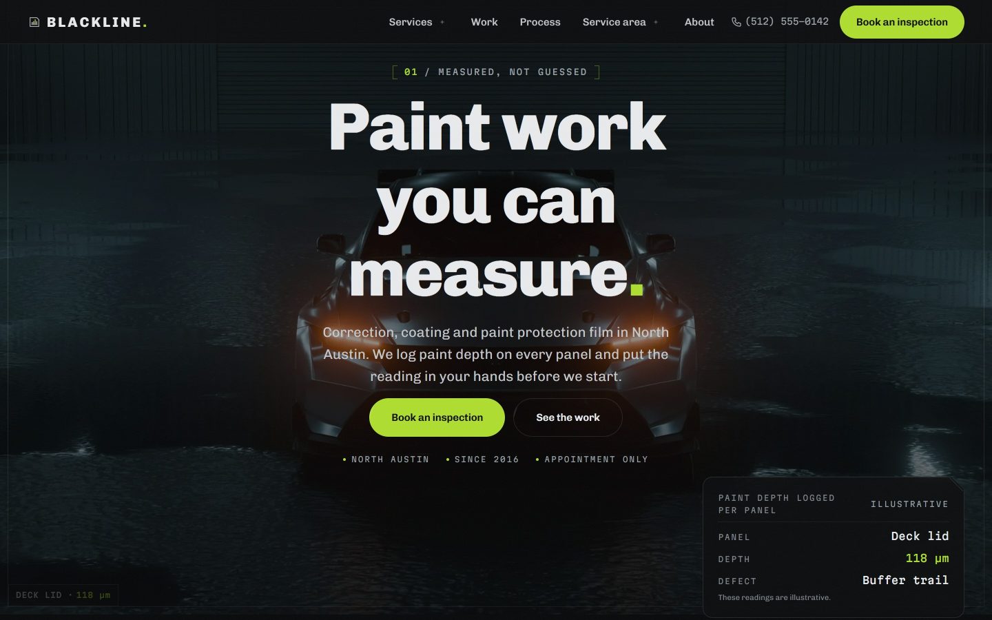
The site is built around that clipboard. Its first heading is Measured, not guessed, and every section is an instance of it.
Prices on the page
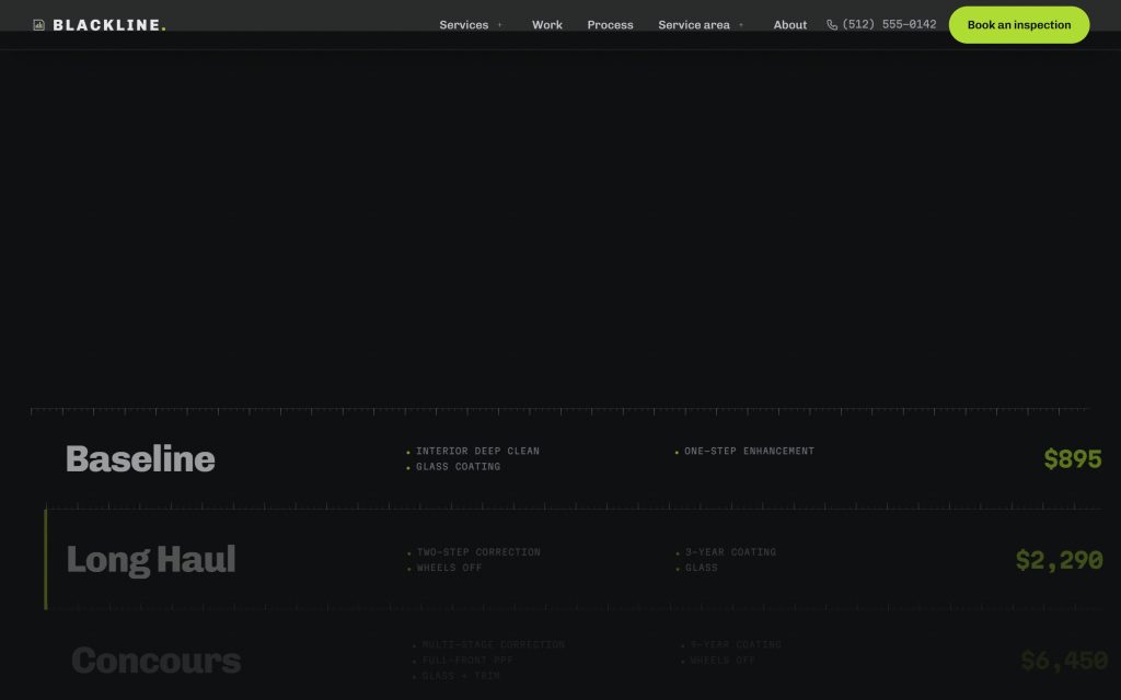
Twelve services carry a published price, before any call. Under them sit four packages — Baseline, Long Haul, Concours, Pre-Sale — and a coverage table that answers the only question a package page ever gets: what does the expensive one actually add. The customer reads it off the table instead of asking.
Five jobs, in full
A Porsche 911 GT3, a Tesla Model 3, a Land Cruiser, a Corvette C8, a Ford Raptor. Each documented start to finish with the readings that justified the work, not a before/after slider with the lighting changed. The section is a list, not a hand-placed collage, so it holds fifty jobs later without a redesign.
Three sections cut
The first draft had a team section with no team, a blog with no articles and a partners strip with two logos. All three are gone. An empty section is worse than a missing one: it tells the visitor the shop had nothing to put there.
The decisions worth naming
No content system, on purpose
Hand-written pages, no WordPress, no page builder. A site like this changes maybe four times a year — a price, a new job — and a content system costs a database, a login, updates and a set of plugins to keep patched, paid monthly, to save the owner two edits a quarter. When that maths flips, the markup is structured so that moving it into WordPress is a template job, not a second project. The right answer is sometimes not the tool I know best.
It looks like a workshop, not a showroom
Every detailing site is black with a car photo. This one keeps the black and borrows the rest from the instrument on the bench: ruler-style graduations, numbers set like a gauge readout, one signal green that appears only where something is measured or confirmed. The car is in the photograph. The design is the workshop.
On mobile
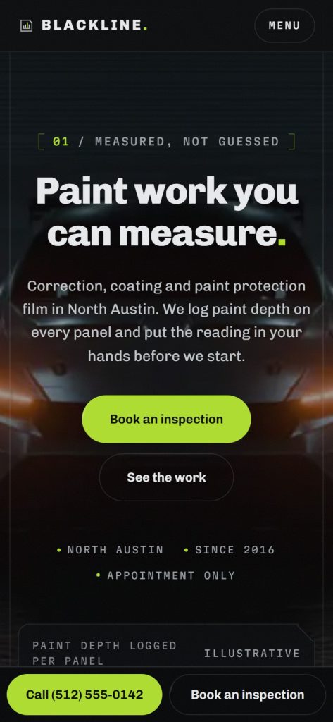
The page reflows to a single column, and a fixed bar at the bottom keeps Call and Book an inspection under the thumb the whole way down. For a shop that takes bookings by phone, that bar is the conversion: the page makes people scroll, the bar makes them call.
What this is built to change
The phone stops being where prices get explained. A caller already knows which band the car falls into, so the first conversation starts at “when can you take it” instead of “what does this cost”. Publishing the price loses the enquiries that were only ever going to ask the price — and those were never customers.
The site itself